Mastering the Spectrum: An In-Depth Exploration of Understanding Color Palettes in CorelDRAW
Introduction
Color is a language of its own, speaking volumes without uttering a single word. In the realm of graphic design, CorelDRAW stands as a versatile canvas where creative minds weave their visual narratives. At the heart of this narrative lies the intricate world of color palettes, a crucial element that shapes the aesthetics and emotional resonance of any design. This comprehensive guide aims to delve into the depths of understanding color palettes in CorelDRAW, empowering designers to wield the spectrum with precision, creativity, and a profound grasp of the tools at their disposal.
The Basics of Color in CorelDRAW
1. RGB and CMYK Color Models:
- CorelDRAW supports both RGB (Red, Green, Blue) and CMYK (Cyan, Magenta, Yellow, Black) color models. Understanding when to use each is vital for projects destined for web or print.
2. Color Wheels and Harmony:
- CorelDRAW’s color wheel serves as a visual aid for selecting harmonious color schemes. From complementary to analogous, designers can effortlessly create balanced and visually pleasing color combinations.
3. Color Management:
- CorelDRAW allows users to manage color profiles, ensuring consistency across different devices and outputs. This feature is crucial for maintaining the integrity of colors in print or digital formats.
Exploring Color Palettes
1. Default Palettes:
- CorelDRAW comes equipped with default color palettes, offering a range of basic and commonly used colors. Understanding these defaults provides a foundation for color selection.
2. Custom Palettes:
- Designers can create custom color palettes tailored to specific projects or brand guidelines. This flexibility allows for consistency in color choices across different elements.
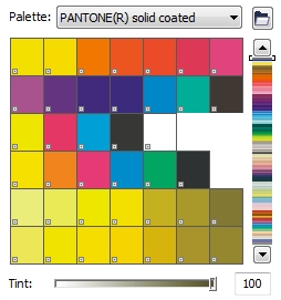
3. Swatch Libraries:
- CorelDRAW includes swatch libraries that feature predefined sets of colors. These libraries cater to various industries and design themes, serving as a valuable resource for designers seeking inspiration.
Color Selection and Modification
1. Eyedropper Tool:
- The Eyedropper tool in CorelDRAW enables designers to sample colors from existing objects. This tool aids in maintaining a consistent color palette throughout a design.
2. Color Harmonies:
- CorelDRAW’s Color Harmonies feature assists designers in creating visually appealing color schemes. By exploring different harmony rules, designers can achieve balance and cohesion in their designs.
3. Color Styles:
- Designers can save and reuse color combinations through Color Styles. This feature streamlines the workflow and ensures uniformity across different elements within a project.
Advanced Color Techniques
1. Interactive Fill Tool:
- The Interactive Fill tool allows designers to apply gradients, patterns, and textures to objects. Mastery of this tool enhances the depth and complexity of designs.
2. Blend Tool:
- CorelDRAW’s Blend tool facilitates smooth transitions between colors and shapes. Understanding how to use this tool adds a dynamic and artistic dimension to designs.
3. Transparency and Opacity:
- CorelDRAW provides options for adjusting transparency and opacity. These features empower designers to create ethereal effects, layering colors for a nuanced visual impact.
Tips for Effective Color Palette Usage
1. Consider the Audience:
- Tailor color palettes to the target audience, considering cultural associations, demographics, and the emotional impact of colors.
2. Test for Accessibility:
- Ensure that color choices consider accessibility standards. Designers should verify that color combinations are legible for individuals with color vision deficiencies.
3. Maintain Consistency:
- Consistency is key to a cohesive design. Establish a primary color palette and adhere to it throughout the project to create a unified visual language.
4. Embrace Contrast:
- Utilize contrast to highlight key elements within a design. Experiment with color variations to emphasize focal points and guide the viewer’s attention.
5. Stay Inspired:
- Constantly seek inspiration from diverse sources. Pay attention to current design trends, cultural influences, and emerging color schemes to keep your palette fresh and relevant.
Conclusion
Mastering color palettes in CorelDRAW is a journey of discovery, experimentation, and artistic expression. This guide, enriched with insights into the fundamentals, exploration of features, and tips for effective usage, equips designers to navigate the vast spectrum of colors within the software. CorelDRAW’s robust tools, combined with a nuanced understanding of color theory, empower designers to create visuals that transcend the ordinary and resonate with depth and emotion. As you embark on your design endeavors, let the language of color in CorelDRAW become your ally, weaving narratives that captivate and inspire.