Seaborn: A Deep Dive into Statistical Data Visualization
Introduction to Seaborn
Seaborn, built on top of Matplotlib, is a Python data visualization library designed to create informative and aesthetically pleasing statistical graphics. It provides a high-level interface for drawing attractive and informative statistical graphics. This comprehensive guide will explore the core concepts, functionalities, and advanced techniques of Seaborn for effective data visualization.
Setting the Stage
Before diving into the world of Seaborn, ensure you have the necessary libraries installed:
Python
import seaborn as sns
import matplotlib.pyplot as plt
import pandas as pd
import numpy as np
Use code with caution.
Understanding Seaborn’s Palette
Seaborn offers a rich palette of color schemes that enhance visual appeal and data interpretation.
- Default palette: Seaborn’s default palette is often suitable for most visualizations.
- Color palettes: Use
sns.color_palette()to create custom color palettes. - Setting global palette:
sns.set_palette()to set a default palette for all subsequent plots.
Relational Plots
Seaborn excels in visualizing relationships between variables.
- Scatter plots:Python
sns.scatterplot(x='x', y='y', data=df, hue='hue_variable')Use code with caution. - Line plots:Python
sns.lineplot(x='x', y='y', data=df, hue='hue_variable')Use code with caution. - Relplot: A versatile function for exploring relationships:Python
sns.relplot(x='x', y='y', data=df, hue='hue_variable', kind='scatter')Use code with caution.
Distribution Plots
Seaborn provides various tools to visualize data distributions.
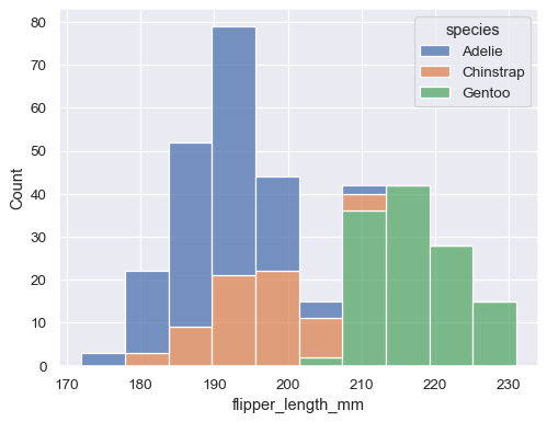
- Histograms:Python
sns.histplot(data=df, x='x', bins=30, kde=True)Use code with caution. - Kernel Density Estimation (KDE) plots:Python
sns.kdeplot(data=df, x='x', shade=True)Use code with caution. - Distplot: A combined histogram and KDE plot:Python
sns.distplot(df['x'], bins=30)Use code with caution.
Categorical Plots
Seaborn offers several plot types for categorical data.
- Bar plots:Python
sns.barplot(x='category', y='value', data=df)Use code with caution. - Count plots:Python
sns.countplot(x='category', data=df)Use code with caution. - Box plots:Python
sns.boxplot(x='category', y='value', data=df)Use code with caution. - Violin plots:Python
sns.violinplot(x='category', y='value', data=df)Use code with caution. - Swarm plots:Python
sns.swarmplot(x='category', y='value', data=df)Use code with caution.
Matrix Plots
Seaborn offers functions to visualize correlations and relationships between multiple variables.
- Pair plots:Python
sns.pairplot(df, hue='hue_variable')Use code with caution. - Heatmaps:Python
sns.heatmap(corr_matrix, annot=True, cmap='coolwarm')Use code with caution. - Clustermaps:Python
sns.clustermap(corr_matrix, cmap='coolwarm')Use code with caution.
Grids and Faceting
Seaborn provides tools to create complex visualizations by arranging multiple plots.
- FacetGrid:Python
g = sns.FacetGrid(df, col='category') g.map(sns.histplot, 'value')Use code with caution.
Customization and Styling
Seaborn offers extensive customization options to tailor plots to specific needs.
- Color palettes:
sns.set_palette() - Styles:
sns.set_style() - Context:
sns.set_context() - Figure-level and axes-level functions: Control plot elements independently.
Advanced Topics
- Time series plots: Seaborn can be used with Pandas for time series visualizations.
- Statistical estimation: Seaborn integrates statistical estimation methods for deeper insights.
- Customizing plot elements: Full control over plot components using Matplotlib.
- Interactive visualizations: Explore integration with libraries like Plotly.
Conclusion
Seaborn is a powerful tool for creating informative and visually appealing statistical graphics. By mastering its core concepts and exploring advanced techniques, you can effectively communicate data insights.