Mastering the Spectrum: An In-Depth Guide to Color Adjustment in Traced Results with CorelDRAW
Introduction:
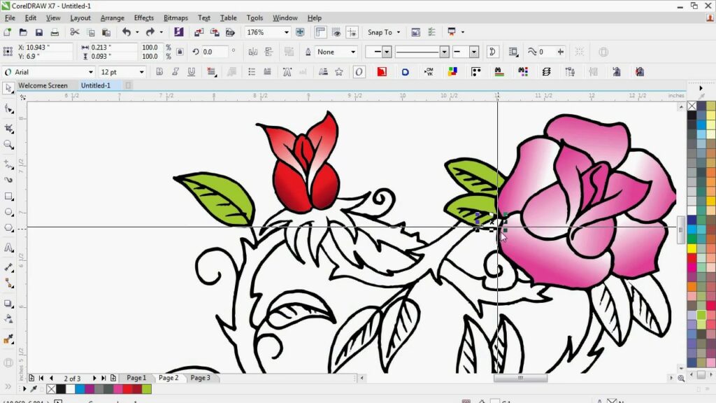
CorelDRAW stands as a beacon in the realm of graphic design, offering a comprehensive suite of tools that empower designers to unleash their creativity. When it comes to transforming raster images into scalable vector graphics, the power of CorelDRAW’s advanced tracing engine, PowerTRACE, shines brightly. In this extensive article, we embark on a detailed exploration of the art of adjusting colors in traced results within CorelDRAW. Understanding the nuances of color manipulation not only enhances the aesthetic appeal of vectorized artwork but also provides designers with the tools to express their creativity with precision.
Understanding Color Adjustment in CorelDRAW:
Color adjustment in CorelDRAW involves refining and modifying the color attributes of traced results. Whether you’re working with a logo, illustration, or photograph, the ability to tweak and fine-tune colors is instrumental in achieving the desired visual impact. CorelDRAW’s robust color adjustment tools allow designers to enhance vibrancy, correct tones, and create captivating color schemes within their vectorized creations.
Importance of Color Adjustment:
- Maintaining Consistency: Adjusting colors in traced results is crucial for maintaining consistency across a design. It ensures that the vectorized output aligns with the color scheme and branding guidelines, especially in projects involving logos or corporate identities.
- Correcting Color Distortions: Tracing algorithms may introduce color distortions in the vectorized output. Color adjustment tools in CorelDRAW enable designers to correct these distortions, ensuring that the colors closely match the original raster image.
- Enhancing Aesthetics: Fine-tuning colors goes beyond mere correction – it allows designers to enhance the overall aesthetics of the vectorized artwork. By adjusting saturation, brightness, and contrast, designers can create visually appealing and striking compositions.
- Creating Mood and Atmosphere: Colors play a significant role in conveying mood and atmosphere in artwork. Adjusting colors in traced results provides designers with the means to evoke specific emotions, set the tone, and create a captivating visual narrative.
- Customizing Color Schemes: CorelDRAW’s color adjustment tools empower designers to customize color schemes according to their creative vision. This flexibility allows for experimentation and personalization, fostering unique and memorable design solutions.
Color Adjustment Tools in CorelDRAW:
- Adjustment Docker: The Adjustment docker in CorelDRAW serves as a central hub for various color adjustment tools. From basic adjustments like brightness and contrast to advanced options like hue and saturation, designers can access a range of tools within this docker.
- Color Balance: The Color Balance tool allows designers to fine-tune the balance of colors in the vectorized artwork. Adjustments can be made to the highlights, midtones, and shadows, providing precise control over the color distribution.
- Brightness/Contrast/Intensity: These fundamental tools allow designers to control the brightness, contrast, and intensity of colors. Whether it’s enhancing vibrancy or creating subtle variations, these adjustments play a pivotal role in refining the visual impact of the traced result.
- Hue/Saturation/Lightness: The Hue/Saturation/Lightness (HSL) tool offers granular control over individual color channels. Designers can tweak the hue for color variations, adjust saturation for intensity, and modify lightness for brightness control.
- Color Balance Docker: The Color Balance docker provides a comprehensive set of controls for adjusting shadows, midtones, and highlights. Designers can experiment with color sliders to achieve nuanced changes in the overall color balance of the vectorized artwork.
Advanced Techniques in Color Adjustment:
- Selective Color Adjustment: CorelDRAW allows designers to selectively adjust colors in specific areas of the vectorized artwork. Using tools like masks and selection options, designers can target and modify colors in a localized manner, achieving a more refined and polished result.
- Gradient Mapping: Gradient mapping involves remapping the colors in a gradient to achieve a specific visual effect. Designers can experiment with gradient mapping in CorelDRAW to transform the color scheme of the traced results, introducing artistic and creative variations.
- Color Temperature Adjustment: For images that require a specific color temperature, designers can adjust the warmth or coolness of colors using temperature sliders. This technique is particularly useful when working with photographs or illustrations that demand a specific color ambiance.
- Color Harmonies: CorelDRAW provides tools to explore and apply color harmonies in the traced results. Designers can experiment with complementary, analogous, or triadic color schemes to create harmonious and visually pleasing compositions.
- Custom Color Presets: Designers can create and save custom color presets for specific projects or design themes. This feature streamlines the color adjustment process, allowing for consistency and efficiency in applying predefined color schemes.
Practical Applications of Color Adjustment in Traced Results:
- Logo Refinement and Branding: Color adjustment is paramount in logo refinement and branding. Designers can ensure that the colors in the vectorized logo align with brand guidelines, evoke the desired emotions, and maintain consistency across various applications.
- Illustrative Artwork Enhancement: Artists and illustrators leverage color adjustment to enhance hand-drawn sketches or scanned artwork. This process allows for creative exploration of color variations and intensities, contributing to the overall visual impact of the vectorized illustration.
- Photograph Vectorization for Print: When vectorizing photographs for high-quality print, color adjustment is critical. Designers can fine-tune colors to ensure that the vectorized image reproduces accurately and vividly in print, capturing the essence of the original photograph.
- Creating Custom Icons and Symbols: Designers often adjust colors to create custom icons and symbols with a distinct visual identity. Fine-tuning colors ensures that the vectorized icons maintain clarity, readability, and consistency with the overall design theme.
- Architectural Plans and Diagrams: In technical drawings and architectural plans, color adjustment contributes to clarity and readability. Designers can use color to differentiate elements, highlight key features, and convey important information within the vectorized diagrams.
Conclusion:
In conclusion, the art of adjusting colors in traced results within CorelDRAW opens up a world of creative possibilities for designers. Whether refining logos, enhancing illustrative artwork, or vectorizing photographs, the precision and flexibility offered by color adjustment tools are instrumental in achieving the desired visual impact.
As CorelDRAW continues to evolve, its robust color adjustment capabilities remain at the forefront of innovations in graphic design. By mastering the techniques and tools for color adjustment, designers can confidently navigate the intricate terrain of vectorization, infusing their creations with vibrant hues, striking contrasts, and captivating color schemes. Embrace the spectrum of possibilities in CorelDRAW, and let your vectorized artwork flourish with the richness and depth that thoughtful color adjustment provides.